Sunday, April 24, 2011

Correlation matrix

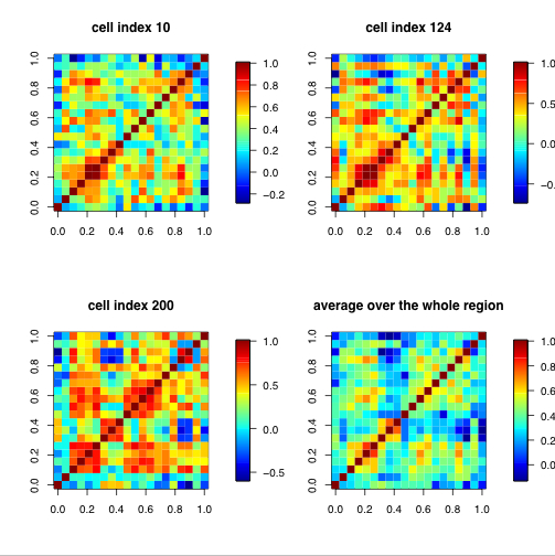
A correlation matrix is a relationship between variables that may be negative, positive, or curved. Correlation is measured and expressed by using numeric scales. It is a that matrix gives the correlations between all pairs of data sets.This example of a correlation matrix is with 20 different climate models at specific geographical locations. Each row and column of the matrix represents one of the 20 models in the study.
http://www.image.ucar.edu/GSP/Projects/ResearchNuggets.shtml

Star chart

A star chart is a graphical process of showing multivariate the form of a two-dimensional chart. Each star represents a single observation. Typically, star plots are generated in a multi-plot format with many stars on each page and each star representing one observation. This star plot shows 16 stars, each representing different kinds of cars.
http://www.itl.nist.gov/div898/handbook/eda/section3/starplot.htm

Saturday, April 23, 2011

Similarity matrix

A similarity matrix is a matrix of scores which express the similarity between two data points. They are used in a sequence of data. This is an example to present songs in a similarity matrix - repetition parts can be seen from the similarity matrix. The example shows musical tempo to segment the music properly: music tempo gives the similarity matrix a new time unit to detect the whole repeating patterns precisely.

Stem and leaf plot

A stem and leaf plot is a device for presenting quantitative data in a graphical format. Similar to a histogram, it assists in visualizing the shape of a distribution. It is often used as a method of counting and ordering numerical data without losing the detail of the individual data. This stem and leaf plot depicts the ages of family members at a family reunion. For example, there is a 1 year old, 8 year old, 32 year old etc..

Histogram

A histogram is a statistical graph that shows the frequency of values of a quantity by vertical rectangles of varying heights and widths. The width of the rectangles is in proportion to the class interval under consideration, and their areas represent the relative frequency of the item in question. This example, is a histogram showing the results of a final exam given to a hypothetical class of students. Each score range is denoted by a bar of a certain color.

Parallel coordinate graph

Parallel coordinate graphs are used to demonstrate numerous sets of data. Each line is a different variable and every line has a connection all the way through the graph. They are used for visualizing the difference of multidimensional data. This is a 3D model of a parallel coordinate view of all cells and nine selected genes.

Triangular plot

A triangular plot is used to illustrate the percentages of three components where the total percentage is 100%.  This triangular plot depicts voting trends. The axes of the figure show the estimated fraction of the population intending to vote for each of the major parties.

Windrose

A windrose is a graphic tool used by meteorologists to give a concise view of how wind speed and direction are typically dispersed at a specific location over a period of time. This is an example of a windrose of Seattle, Washington. The majority of the wind speed is between 7 - 11 knots.

Climograph

A climograph is a geographical representation of important climatic factors. It is used for a quick-view of the climate of a location. It is a graph that depicts the annual cycle of temperature and rainfall for geographical locations. Typically, one vertical access shows temperature, the second vertical access shows rainfall, and the horizontal access shows time. This climograph shows the annual precipitation and weather for Brazil.

Population profile

A population profile shows the number of people as a function of the thier age. Population profiles can be displayed in many different forms such as pie charts or bar graphs. This bar graph shows the percent of population of U.S. immigrants by age in 2004.

Scatterplot

A scatter plot is a graph made by plotting ordered pairs in a coordinate plane to show the correlation between two sets of data. The value of one variables determines the position on the horizontal axis and the value of the other variable determines the position on the vertical axis. The example below has two pieces of information (years of experience and income) - these are the two variables that determine if a relationship exists.  X represents experience and Y represents income. Notice how the line drawn through the data points has an upward slope.  This slope represents the direction of the relationship and tells us that as experience increases so does income.

Index value plot

The index value plot shows the relationship between what is considered normal and actual values. The index is the average and values are compared to it along the center line. The index value plot will help show discrepancies between data information. This index value plot shows the relationship between what is considered normal streamflow and actual values. It shows whether the streamflow was wet (above average), average, or dry (below average) since 1999 in New Mexico.

http://drm04h.blogspot.com/2010/04/index-value-plot.html

Accumulative line graph or Lorenz curve

 The Lorenz curve is used in economics and ecology to describe inequality in wealth or size. It is a graphical representation of the cumulative distribution function of a probability distribution. It is practical in relating inequality among the size of individuals in ecology and also useful to represent income distribution. The graph below shows the proportion of income going to the poorest people, middle-class people and wealthiest people.
http://www.squarecirclez.com/blog/the-gini-coefficient-of-wealth-distribution/4187

Friday, April 22, 2011

Bilateral graphs

Bilateral graphs are used to display data when there is both positive and negative values. They show the positive and negative gains on a map. Bilateral Graphs are typically bar and line graphs. This map shows the correlation of gas prices and consumer spending from January - November 2007.  As gas prices increase, consumer spending decreases.

Nominal area choropleth map

Nominal area choropleth maps are used to represent nominal data to a given region. This nominal area choropleth map shows the percentage of hispanics living in each state. Darker states represent more hispanic people living there.

Unstandardized choropleth maps

Unstandardized Choropleth maps use color showing average value or other data in a geographic area.  Unstandardized choropleth maps use raw numbers that cause the data outcome to be raw data instead of an average. This example shows the fertility rate throughout the world.
http://similaritymatrix.blogspot.com/2009/11/unstandardized-choropleth-map.html

Standardized choropleth maps

Standardized choropleth maps show areas shaded or patterned in proportion to the measurement of the statistical variable being displayed. This exmaple shows the relation of crime rates in the US during 2003 vs election results of 2004. The higher the crime rate is corresponded with a darker shade of pink.

Univariate choropleth maps

Univariate choropleth maps measure one variable/data set cartographically. This univariate choropleth map measures water usage by each state. The darker states consume more water than the lighter states with California, Texas and Florida using the most water.

bivariate choropleth map

A bivariate choropleth map portrays two separate trends simultaneously. The main objective of a bivariate map is to find a simple method for accurately and graphically illustrating the relationship between two spatially distributed variables. This is an example of the 2008 presidental election. It shows the canidate each state voted for and the electoral college votes. 
http://rvclearance.com/index.php?option=com_content&view=article&id=93%3Awhat-do-the-2008-election-results-mean-to-the-economy-and-the-rv-industry&catid=3%3Anewsflash&Itemid=50

Unclassed choropleth maps

This technique assigns shadings proportional to the data values so that these choropleth maps do not have to classify the data. An unclassed choropleth map is similar to a classed choropleth map, except there are no specific classifications. These maps can show the same information of a classed map but it is harder to determine the accurate perception of the map, which is why this method of mapping has not been generally accepted. This map represents the  rates of illiteracy in France.

http://euclid.psych.yorku.ca/SCS/Gallery/milestone/sec5.html

Classed choropleth maps

Classed choropleth map ss a map that uses graded differences in shading or color or the placing of symbols on the map in order to indicate the average values of some property or quantity in those areas. This would involve creating a classed frequency legend including a frequency histogram, a frequency curve, and shading. This map is an example of a choropleth map that shows total spending of overseas residents in Great Britain in 2003.

http://www.neighbourhood.statistics.gov.uk/dissemination/Info.do;jessionid=ac1f930c30d56e375c393b14479d8644f3c0d6e19544?m=0&s=1303506180193&enc=1&page=userguide/detailedguidance/statisticalpresentation/statisticalmaps/best-practice-statistical-maps.htm&nsjs=true&nsck=true&nssvg=false&nswid=1362

Range graded proportional circle map

Range-graded proportional scaling maps are used by dividing data into groups. The design is for symbol size relation, usually in circles or dots, for adjacent classes so that the map reader can easily distinguish between circle or dot sizes, and therefore, categories. This is an exmaplel of each state's capital population from 1999. As many other stats have proven, a mojority of US citizens live on the east coast.

Continuously variable proportional circle map

Continously varialble proportional cirlce maps depict data using dots that are proportional in scale and location to the information being shown. In this exampe,the map shows the proportion of different types of meat that were sent to Paris butcheries from different regions in France. Western France holds a distinct advantage in meat production when compared to Eastern France.
https://www.e-education.psu.edu/geog486/l5_p5.html

DLG

A Digital Line Graph (DLG) is digital vector data representing cartographic information. DLGs have a variety of information portraying geographic features (for example, boundaries, roads, utility lines, etc). This image is of Tallahassee, FL depicting roads and interstates.

DRG

A Digital Raster Graphic (DRG) is a scanned image of a United States Geological Survey (USGS) standard series topographic map. DRGs help assess the completeness of digital data from other mapping agencies, and can also be used to produce "hybrid" products. This DRG is a partial map of Lake Lynn Wyoming with hillside shading.

Isopleths

An isopleth  is a contour line of equal or constant values. Lines of equal value are drawn such that all values on one side are higher than the "isoline" value and all values on the other side are lower. They are often used for population density.This map shows changes in the amount of acid rain resulting from legislative efforts of the Clean Air Act Amendments.
http://www.dep.state.pa.us/dep/deputate/airwaste/aq/acidrain/isomaps.htm

Thursday, April 21, 2011

Isopach

Isopaches are points that connect lines of equal thickness of a geological layer formation or group of formations. They are often used on sediment, petroleum and volcanoes.This is an example of an Isopach map of sediment rock being deformed by faults in New Zealand. The lines follow the thickness of the land which measures how much is being lost.

Isohyets

Isohyet lines are connecting points that have the same amount of rainfall during a given time. The contours on this map are isohyets showing July 2008 rainfall in 100mm bands in New Zealand.
http://www.scoop.co.nz/stories/AK0808/S00090.htm

Isotachs

Isotachs are lines in a given surface connecting points with equal wind speed.
This is a model of constant wind speed lines. Bold straight lines shows path of the cross-section used to depict wind circulation shown in the figure.
http://www.crh.noaa.gov/lmk/?n=paper-1/17/94
Isobars, in use of weather maps, are lines of equal atmospheric pressure drawn on a meteorological map. Each line passes through a pressure of a given value that never cross eachother. This is an example of  describing the patterns of air pressure, over the Great Lakes, that include one or more closed, circular isobars.
http://www.newmediastudio.org/DataDiscovery/Hurr_ED_Center/Hurr_Structure_Energetics/Closed_Isobars/Closed_Isobars.html

LIDAR

Light Detection And Ranging, or LIDAR, is an visual remote sensing technology that can calculate the distance to, or other properties of a target by revealing the target with light, often using a laser. They are used to scan buildings, mountains and even roads. This image  is of a New York City after the 9/11 attacks.
Height data from LIDAR measurements can be shown visually like this.
http://rst.gsfc.nasa.gov/Sect8/Sect8_8.html

Doppler radar

A Doppler radar uses the Doppler effect to measure velocity. More specifically, it measures the change of wavelength caused by motion of the source. For example a police siren approaching, passing, and then receding from you. This image provided the British forces with an early warning system by generating realtime data tracking German aerial activity over, or approaching, the United Kingdom.
http://serialconsign.com/2008/07/early-radar-technology

Black & white aerial photo

This black and white aerial photo is of Wrigley Field. Black and white aerial photos are different from infered photos because of the the light intake. Wrigley Field has real grass that shows up lighter than artificial turf which shows up dark.
http://www.horschgallery.com/addtocart2.aspx?pdctid=%C5%BEE%1A

Infrared aerial photo

Infrared aerial photos and infrared digital sensors are sensitive to a certain portion of the spectrum of light used by air crafts; most notably used by military, weather and police forces. This image is a color infrared aerial photograph. Apparently, the football field has artificial turf which has minimal infrared reflectance.

Cartographic animations

Cartographic animations are used in animated maps with computer graphics to include an image usually showing time. Some examples are animation of the Japanese tsunami’s waves spreading across the Pacific Ocean or a Hurricane Katrina coming across the Gulf of Mexico to slam into New Orleans. This image shows the later.  
http://www.lightrailnow.org/news/n_newslog004.htm

Statistical map

A statistical map is variation in quantity of a factor such as population, snow, or just about any kind of statistic is used in a geographic area. One example is a bar graph. This particular map uses bars in agreement with Internet growth rates in Africa during the mid 1990s.

http://personalpages.manchester.ac.uk/staff/m.dodge/cybergeography/atlas/census.html

Cartograms

A cartogram is a map that shows a distorted image in order to display the information being given. Some examples are, population, GNP, child mortality, or energy use. This catogram displays each country's population by size of the country.
 http://www-personal.umich.edu/~mejn/cartograms/

Flow maps

Flow maps give a visual representation of tracking information or  objects from one place to another. This particular flow map shows the movement of the West Nile Virus in accordance with proximity to the Mississippi River. The height of each state is based on confirmed cases of the disease
http://www.scisoftware.com/environmental_software/detailed_description.php?products_id=138

Monday, April 18, 2011

Isoline map

This isoline map displays areal distribution of annual precipitation in China. The isohyet expands in a broad northeast-southwest direction and divides the country into two sections. To the west lie China's main pastoral regions and some deserts. To the east are the main agricultural areas. Isoline maps have continuous lines joining points of the same value. Some examples would be equal altitude, temperature, barometric pressure, wind speed, wind direction, and wind shear.
http://www.greenstone.org/greenstone3/nzdl%3Bjsessionid=5ECDCCE4E59E8E65286429EA47AC9289?a=d&d=HASH01815a5264fa0f4bfa328693.10&c=ccgi&sib=1&dt=&ec=&et=&p.a=b&p.s=ClassifierBrowse&p.sa=

Proportional circle maps

This proportional map shows the 185 known impact craters on the Earth. The size of each circle is proportional to the crater's diameter. Red color represent the terrestrial impacts, light blue - marine impacts. The majority of the impacts have been in North America and Europe.

http://tsun.sscc.ru/tgi_9.htm

Choropleth maps

This choropleth map, in which areas are shaded or patterned in proportion to the measurement of the statistical data being displayed on the map, displays the increasing divorce rates in America from 1980 to 1990. This type of map provides a simple way to visualize how a measurement varies across a geographic area or it shows the level of variability within a region.
http://axellelormans.wordpress.com/2010/02/

Dot distribution maps

This dot distribution map, used by the U.S. Census Bureau, presents the population distribution of the United States in 2000. Each dot represents 7,500 citizens.  The website brought an interesting fact - in this map, the states of Alaska and Hawaii are in more relative positions (population-wise) to the conterminous United States than in earlier map series.
http://www.census.gov/geo/www/mapGallery/2kpopden.html

Propaganda maps

This propoganda map exhibits Adolf Hitler's attempt to unite German-heritage people throughout the world to come to the aid of the Nazi Socialists. This piece of propaganda attempted to inflate the number of possible-Nazis into the hundreds of millions during 1938.
http://longstreet.typepad.com/thesciencebookstore/2010/02/propaganda-maps-potential-nazi-supporters-1938.html

Hypsometric maps

Hypsometric maps are a variant on contour lines. They depict ranges of elevation as bands of color, usually in a graduated scheme. This hypsometric map, provided by NASA, shows the varrying elevation on the moon.
http://reference.findtarget.com/search/NASA%20World%20Wind/

PLSS maps

This Public Land Survey System map shows a site located within Seward Meridian area of Alaska. Each section is labled by meridian, township, and range. Section 33, displayed here, is labled as S017N002W33 - S  for Seward Meridian, N for north, W for west, and 33 is for the section number. It looks as if each section is broken into specific increments of space for example, 10x10 sq miles.

http://www.ak.nrcs.usda.gov/technical/plss.html

cadastral maps

A cadastral map is a map that shows the boundaries and ownership of land parcels. This map shows the total area of Taiwan is about 3.6 million hectares(10,000 sq meters). Up to 2009, about 3.40 million hectares of land have been surveyed and registered which accounts for 90% of total, and the unregistered area is about 360 thousand hectares which accounts for 6% of total.
http://www.nlsc.gov.tw/websites/nlsceng/make_page.aspx?la=2&le=2&li=53&sno=152

Thematic maps

Thematic maps, hence the name, represent a theme to a particular geographic area. This thematic map displays the average age of people living in north eastern United States in year 2000. It  looks like many older citizens live in Maine, Vermont,  Connecticut, Pennsylvania, and West Virginia

http://www.lib.wsc.ma.edu/censusaff.htm

Topographic map

This is a topographical map of Hawaii by France. One can see the circles aroud the base of two mountains depicted are larger because they are closer to sea level. As the elevation of the mountains rise the circles become tighter around the top.
http://commons.wikimedia.org/wiki/File:Hawaii_Island_topographic_map-fr.svg?uselang

Planimetric map

This is a picture of a British gas energy plany from 1901. Its purposes is to show the process by which the gas was manufactured at a particular gasworks, and then to discover the other individual components of the gas plant. The individual locations of gas manufacture and of the gasyard component devices are present-day locations of leaks, spills and discharges to and into the ground.

http://www.hatheway.net/03_gas_plant_components.htm

Thursday, April 7, 2011

the New Yorker

This is an example of someone's a mental image of New York City. One can tell whomever made this map put some time into it because of the clever names for each of the boroughs. I feel many of the names corrispond to the cartogropher's ethnic description of New York City's layout.