Sunday, April 24, 2011

Correlation matrix

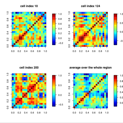
A correlation matrix is a relationship between variables that may be negative, positive, or curved. Correlation is measured and expressed by using numeric scales. It is a that matrix gives the correlations between all pairs of data sets.This example of a correlation matrix is with 20 different climate models at specific geographical locations. Each row and column of the matrix represents one of the 20 models in the study.
http://www.image.ucar.edu/GSP/Projects/ResearchNuggets.shtml

Star chart

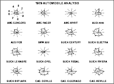
A star chart is a graphical process of showing multivariate the form of a two-dimensional chart. Each star represents a single observation. Typically, star plots are generated in a multi-plot format with many stars on each page and each star representing one observation. This star plot shows 16 stars, each representing different kinds of cars.
http://www.itl.nist.gov/div898/handbook/eda/section3/starplot.htm

Saturday, April 23, 2011

Similarity matrix

A similarity matrix is a matrix of scores which express the similarity between two data points. They are used in a sequence of data. This is an example to present songs in a similarity matrix - repetition parts can be seen from the similarity matrix. The example shows musical tempo to segment the music properly: music tempo gives the similarity matrix a new time unit to detect the whole repeating patterns precisely.

Stem and leaf plot

A stem and leaf plot is a device for presenting quantitative data in a graphical format. Similar to a histogram, it assists in visualizing the shape of a distribution. It is often used as a method of counting and ordering numerical data without losing the detail of the individual data. This stem and leaf plot depicts the ages of family members at a family reunion. For example, there is a 1 year old, 8 year old, 32 year old etc..

Histogram

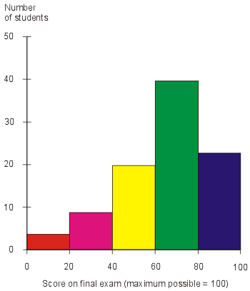
A histogram is a statistical graph that shows the frequency of values of a quantity by vertical rectangles of varying heights and widths. The width of the rectangles is in proportion to the class interval under consideration, and their areas represent the relative frequency of the item in question. This example, is a histogram showing the results of a final exam given to a hypothetical class of students. Each score range is denoted by a bar of a certain color.

Parallel coordinate graph

Parallel coordinate graphs are used to demonstrate numerous sets of data. Each line is a different variable and every line has a connection all the way through the graph. They are used for visualizing the difference of multidimensional data. This is a 3D model of a parallel coordinate view of all cells and nine selected genes.

Triangular plot

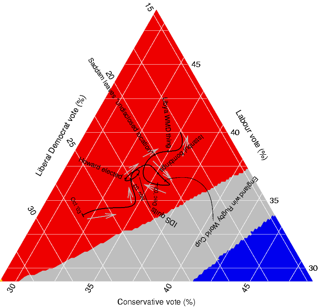
A triangular plot is used to illustrate the percentages of three components where the total percentage is 100%.  This triangular plot depicts voting trends. The axes of the figure show the estimated fraction of the population intending to vote for each of the major parties.